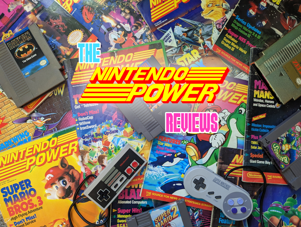
Nintendo Power Review: Issue 1 - July/August 1988
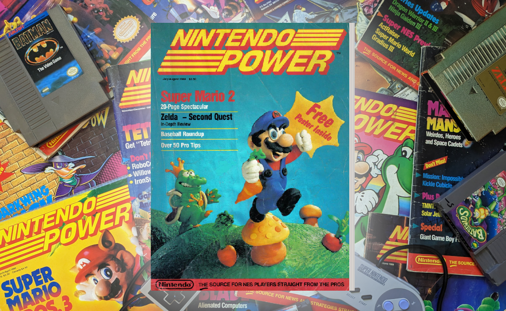
Here we are, issue number one, and it starts off SUPER strong with the iconic cover art! Mario looks fantastic, but let's take a moment to appreciate the impressive clay rendition of Wart. They really nailed it! In another decade most game magazines would just be using official artwork for covers, and it always seems so bland to me. I love when artists in these old magazines were allowed to go weird and wild. And as we'll see inside, boy did they ever!
I should mention that this post might be a bit longer than the ones that come after it, since everything will be new. I don't know if I'll need to talk about the contents page or the inside ad for every issue going forward! Also if you'd like to follow along, you can read this issue on Archive.org.
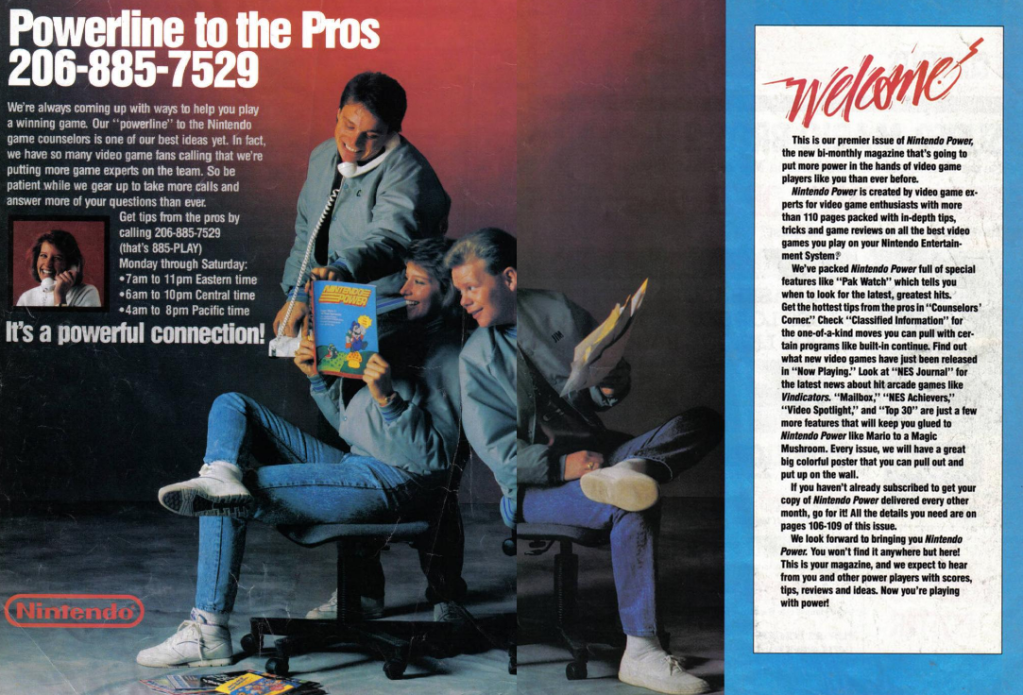
Before we dive into the content, let's take a moment to appreciate the inside cover and the first page. They feature a two-page spread advertising Nintendo's call-in hint line. This is the only ad you'll see in the entire magazine, because for the longest time Nintendo Power didn't allow advertisements. I mean, I guess you could argue that the whole magazine was an advertisement, really. But still, it's nice to know that you'll get cover to cover info instead of ads! Also that little text box on the right isn't part of the ad, it's a little editor's corner thing welcoming you to the first issue. I don't know if I ever noticed that, I think I just glanced over it assuming it was more ad copy. Also check out the magazine they're holding; it's the first issue here, but with a cartoon illustration on the cover instead of the final clay art!
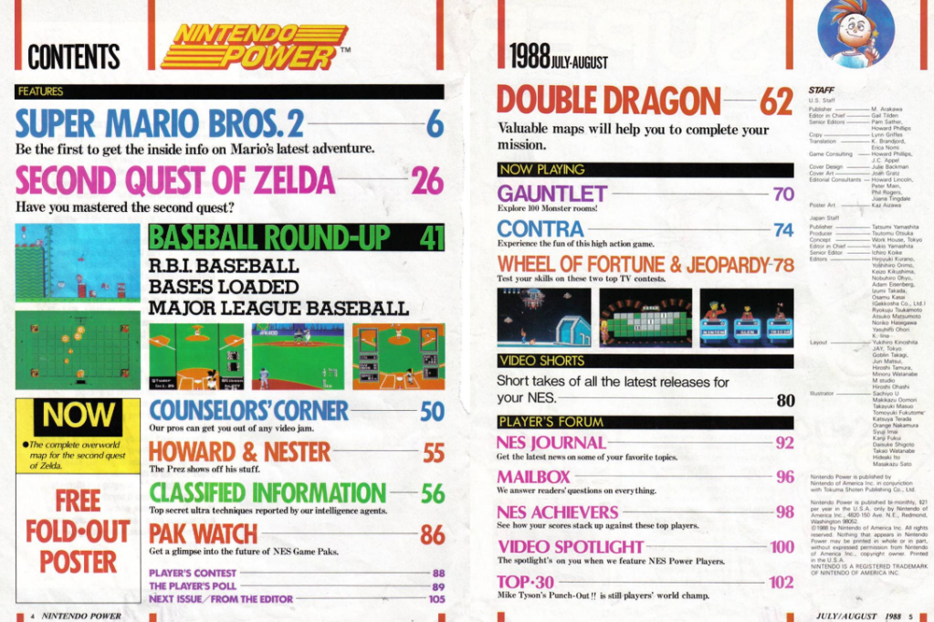
Now, let's check out the table of contents, giving us a sneak peek at what this amazing first issue has in store for us. They've even included descriptions under many of the articles, which is helpful because, let's face it, in the first issue, we might not know what "Video Shorts" is all about. I like how colorful everything is, cycling through various colors for the headline articles. That lower left portion of the page seems weird though. Do they always mention the fold out poster on their contents page? And why does it say 'NOW' in HUUUGE letters?? The overworld map it's talking about is on the reverse side of the fold out poster. They could have used that space to put another cool illustration like how they have Nester in the upper right. Weird choice.
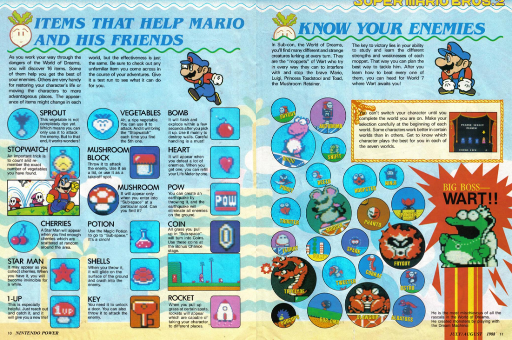
The next 20 pages are dedicated to Super Mario Bros 2! That's some crazy huge coverage for one game, but of course, it's Mario, that's why readers are here, and they deliver. Seeing how different Mario 2 is to the first, they really go in-depth explaining what you'll find. Every technique, every enemy, every item, they go into it all in great detail, and then after all of that they start with the maps. The first two worlds (1-1 to 2-3) get complete maps, showing where each item that you can find in the ground is it, where to put potions to find the mushrooms, everything is covered here. The art is a delightful mix of official and original illustrations, with the off-model original stuff oozing with personality. So much character! Thank you for drawing a Mario fearing for his life as he runs with a key, Phanto in quick pursuit. I needed that.
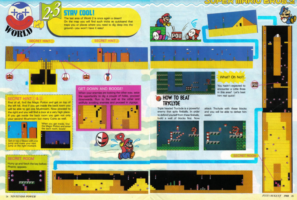
Now, let's take a moment to appreciate the fact that back in those days, getting screenshots involved taking pictures of a TV screen while the game was being played. That means their maps often have lots of Marios standing around, and it's oddly amusing. Just imagine the effort required to stitch all those pictures together to create the maps. It's mind-boggling!
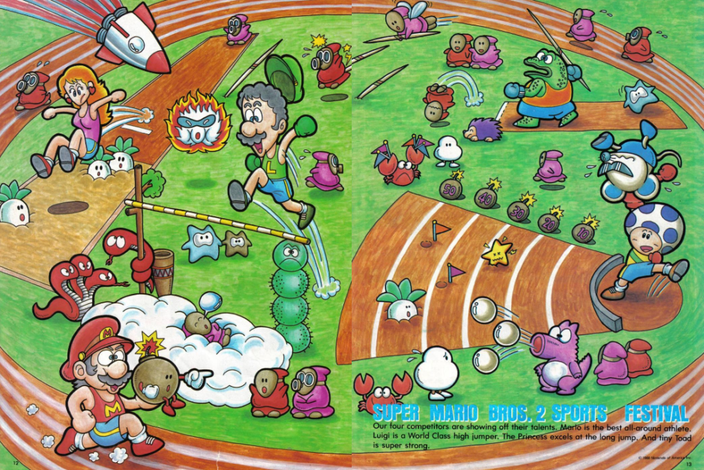
I was initially going to breeze through this, but it's just too bizarre not to mention. Right in the middle of the Mario 2 coverage, we're treated to a massive two-page illustration featuring Mario, Luigi, Toad, and Princess competing in Olympic-style sports. The reason? To highlight the differences between the characters! Princess rocks a long jump, Luigi can leap to new heights, Toad showcases his strength by lifting poor Mouser overhead, and Mario… well, Mario is just there, being the all-around best. I guess it's hard to visually represent that. Princess Toadstool is missing her nose, and her mouth takes a sharp 90 degree drop there, but I think she still looks better than she does on the first page of coverage, where I'm concerned her twig-like neck can't handle the weight of that big round head.
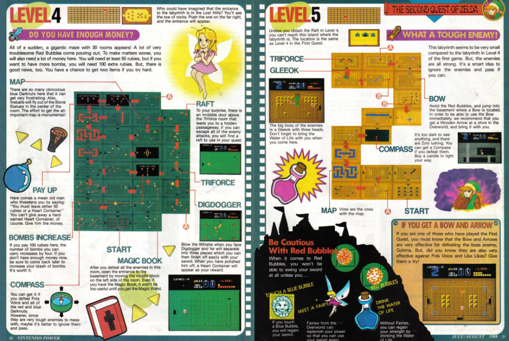
Moving on, we delve into about ten pages covering Zelda's second quest. No, not to be confused with Zelda II, which hadn't been released yet. This is the quest you unlock after beating The Legend of Zelda or by entering 'ZELDA' as your name. The second quest features different dungeon layouts and changes to the overworld map. Honestly, I've never tackled it myself, but Nintendo Power has our backs with complete maps for the first six dungeons and an overworld map. I think almost all the art is from the instruction manual, with the exception of one drawing of a fairy! Which is weird, because they already have art of a fairy from the manual. Guess they wanted more!
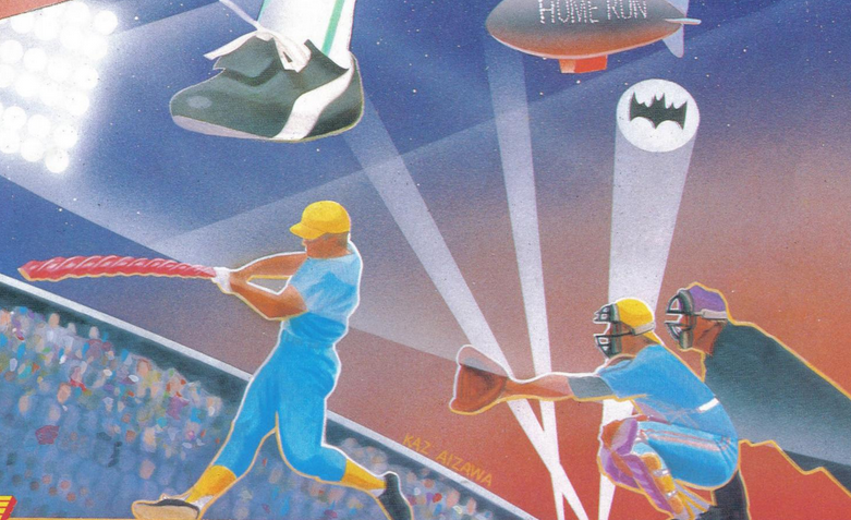
The Zelda coverage goes into the pull-out poster, where the one side is the full overworld map, and the other side is a poster for...various baseball games? Hold on a second, why didn't we get a poster for Super Mario Bros 2? One the plus side, the poster had some nice personality and gets a bit wacky, like this one player using what is clearly a giant Twizzler for a bat, and the bat signal being cast into the sky!
And speaking of baseball. The next feature is eight pages of baseball games R.B.I. Baseball and Bases Loaded. I can't say I have any interest in these pages, and I'm sure I quickly flipped through the pages to get to something more interesting. But let's stop for a moment and look at one of these pages.

I. Love. This. This crazy layout, this weird looking illustration of a baseball guy, the bright colored chain link fence background, I love all of it. Peak 1980s there, and just a really fun magazine layout. I love the tilted filmstrip layout in the bottom corner, and the starburst 'HIT'. There's a lot of colorful randomness here, and I'm not just nostalgic for this time period now, when the magazine would later get very 90s, I'd really miss this original identity of the magazine. It's busy, it's colorful, but there's still purpose to that layout, things have room to breath where they should, I find it very pleasant to look at.
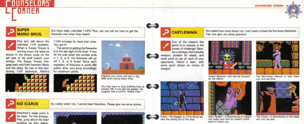
Next we get the regular feature Counceller's Corner. These take reader's questions and help them through tougher areas, though we know now that sometimes the magazine's editors just had the tips on hand already and made up a reader question. This two page spread covers some really great tips, with the 1-Up trick from Mario 1, tips on various boss battles in Castlevania 1, some boss strategies for Kid Icarus, even how to beat Mike Tyson. The layout here never really changes from what I remember, though I wonder if those illustrations in the middle to make it look like a spiral bound notebook are in the later issues, it's a nice touch.
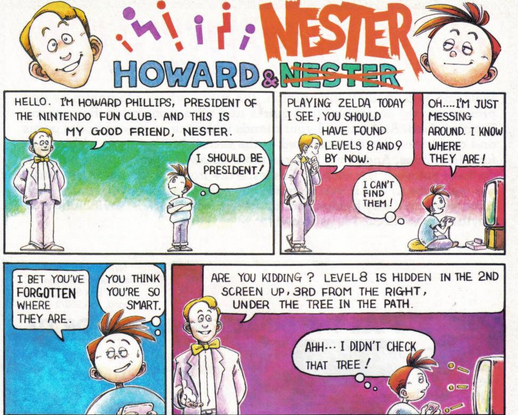
Now, let's talk about something everyone who grew up reading Nintendo Power knows and loves—Howard and Nester comics! Each issue Howard and Nester would usually be depicted inside an NES game and there would be some gameplay tips worked into the story. The first issue plays it a little straight, simply introducing our two new characters and how their personalities differ, with Howard being a friendly encyclopedia or video game trivia, and Nester being the showoff gamer who really doesn't know as much as he wants people to believe. It's a humble start to what will become a beloved series of comics.
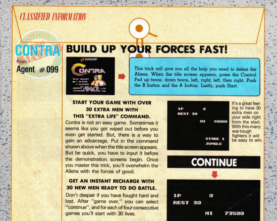
Ah, Classified Information. Those great backgrounds of manila folders meant to house all our greatest video game secrets. This section is kind of the reverse of Counceller's Corner, where gameplay tips from readers are printed. Their names are never shown, just Agent #001 or whatever. Once again, the editors would sometimes put tips in here that weren't sent in. Contra's 30 guy code is sent in by Agent #099. Thanks 99, you made that game way more playable when I was younger!!!
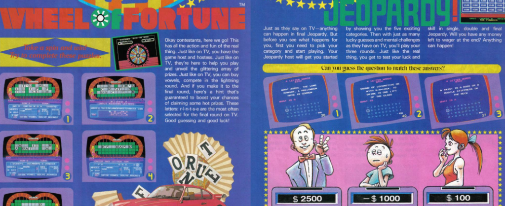
Following that, we have extensive coverage of Double Dragon, Gauntlet 2, and Contra, complete with maps and impressive layouts. However, it seems that most of the artwork in this section comes directly from the game companies. Then we get a two page feature on game show games, specifically Wheel of Fortune and Jeopardy. And my god I can't turn the pages fast enough. Thank goodness some original illustrations have made their way in here, because the screenshots of these games are super bland!
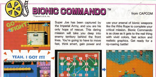
Next up is "Video Shorts", which is essentially a preview section of upcoming games. Each game preview has a little phrase jumping out randomly, like "Come on!", "Yeah I got it!" and "Go fight!".
After that is a section called Pak Watch, which is...also a section on upcoming video games? Although these seem to be further out, with the games only having a few sentences to describe them, and in most cases no screenshots.
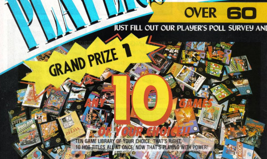
The monthly Player's Poll contest. I entered almost every month and never even got a runner up prize of a Nintendo Power t-shirt. Sometimes their prizes were great, sometimes they were ultra lame. They were off to a great start on this one, offering a grand prize of 10 NES games of your choice! Hey, not the most original idea, but who wouldn't want 10 NES games? I was lucky to get a couple on my birthday and another couple for Christmas. Ten at once would have been awesome! Each issue had a card you could tear out and send in, you just had to answer a few questions (hence the 'poll' part) usually dealing with what games you were excited about and stuff like that.
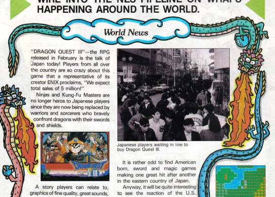
NES Journal was a chance to talk about video gaming news in the world, and once again, the artists are really pulling their weight on these pages! Check out this article on the Japanese release of Dragon's Quest III. Such a cool little dragon illustration kind of bordering the article.
Surprisingly, this issue has two different sections for reader's mail: "Mailbox" and "Video Spotlight." The latter appears to be a mailbox section specifically dedicated to readers' achievements, allowing them to proudly call themselves "Power Players." I don't think they kept these sections separate for very long, it will be interesting to see how long this takes.
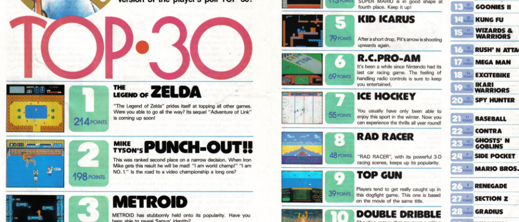
Rounding out the back end of the magazine is NES Achievers, where you could send in your high scores and they would print them. They made sure to tell readers how to get a good screenshot of their game achievement, by using a 35 mm camera with no flash and as little outside light to reduce glare on the screen. Then there's the top 30, which in this magazine Zelda is topping.
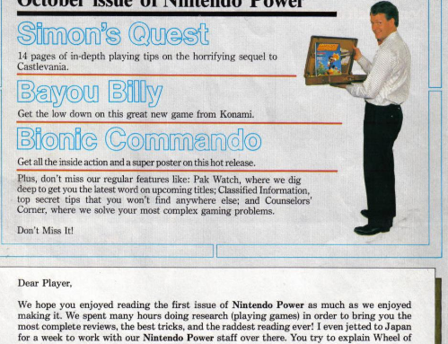
Finally, we glimpse a preview for the next issue, teasing the cover feature: Castlevania II: Simon's Quest. Howard Phillips concludes the magazine with a final message, accompanied by a goofy picture of himself.
And with that, we've explored the entirety of the first issue of Nintendo Power. It's an exhilarating start, filled with detailed game coverage, quirky illustrations, and a glimpse into the world of gaming in the 1980s. As we move forward, it will be interesting to see how the magazine evolves and how it captures the ever-changing landscape of video games.
Thanks for exploring this issue with me, and I hope you look forward to continuing through the first year!