Nintendo Power Reviews Issue 2
Welcome to the second Nintendo Power review. Looking through issue one was a lot of fun, but to be honest I've looked through that issue a ton of times. I'm kind of looking forward to the next few issued because I'm a lot less familiar with them. It's September/October 1988, the NES is the hottest thing around, so let's see what the pages of Nintendo Power had to tell us. Read along on Archive.org.
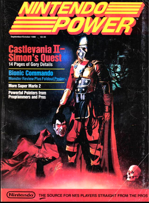
While the first issue's cover was iconic, this one kind of missed the mark in more ways than one. I mean, the outfit isn't THAT bad, but that knight's helmet Simon Belmont is wearing here seems so weird. He never wears a helmet, and I can only assume that they just didn't want the model's face visible? Why not just hide his face in shadow or something?
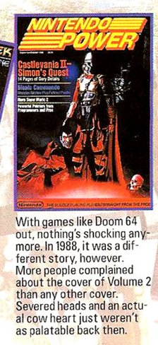
This cover is also worth mentioning because they apparently had a lot of parents complain about the shocking violence of Simon holding the severed head of Dracula! Also, issue 100 mentions that's a real cow's heart on the cover. I never noticed Dracula's parts sitting there. Geez man!

Once again, there's another ad on the inside cover for Nintendo, and it is absolutely a gem. The colors, those sunglasses, the surfing, this is totally 80s.
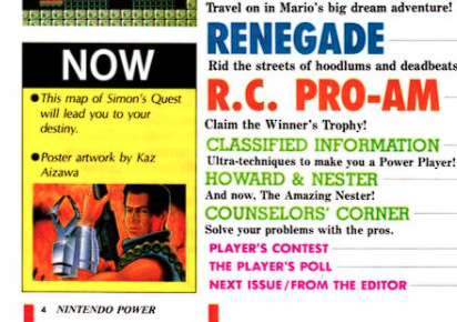
Side note on the table of contents page, once again there's a box with a big "NOW" talking about the poster and reverse side map, so I guess that was a thing for a little while at least? I wonder how long that lasts. I'm going to go out on a limb and predict that by the last issue of this first year it will be gone, because that's where my subscription started and I don't remember it!
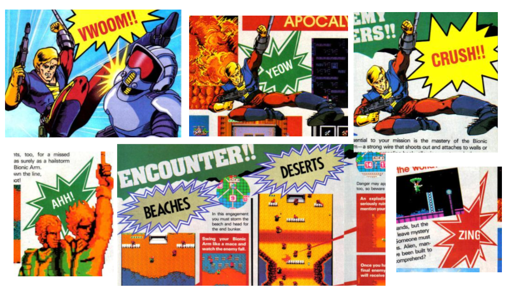
Castlevania II may be the cover story, but the first game to get featured is actually Bionic Commando. Much like the other coverage at this time, it's packed with carefully stitched together maps filled with every single tip and strategy you could need. I think the art they're using here looks like it's mostly reused official stuff. But I have to mention the random sound effects written in star bursts, with phrases like "VWOOM!!", "ZING" and "AHH". The layouts still get me, they are so colorful. Like, why would you have a white page with black text, when you can have red text boxes with white text inside? There's just color and a busy-ness everywhere and I love it.
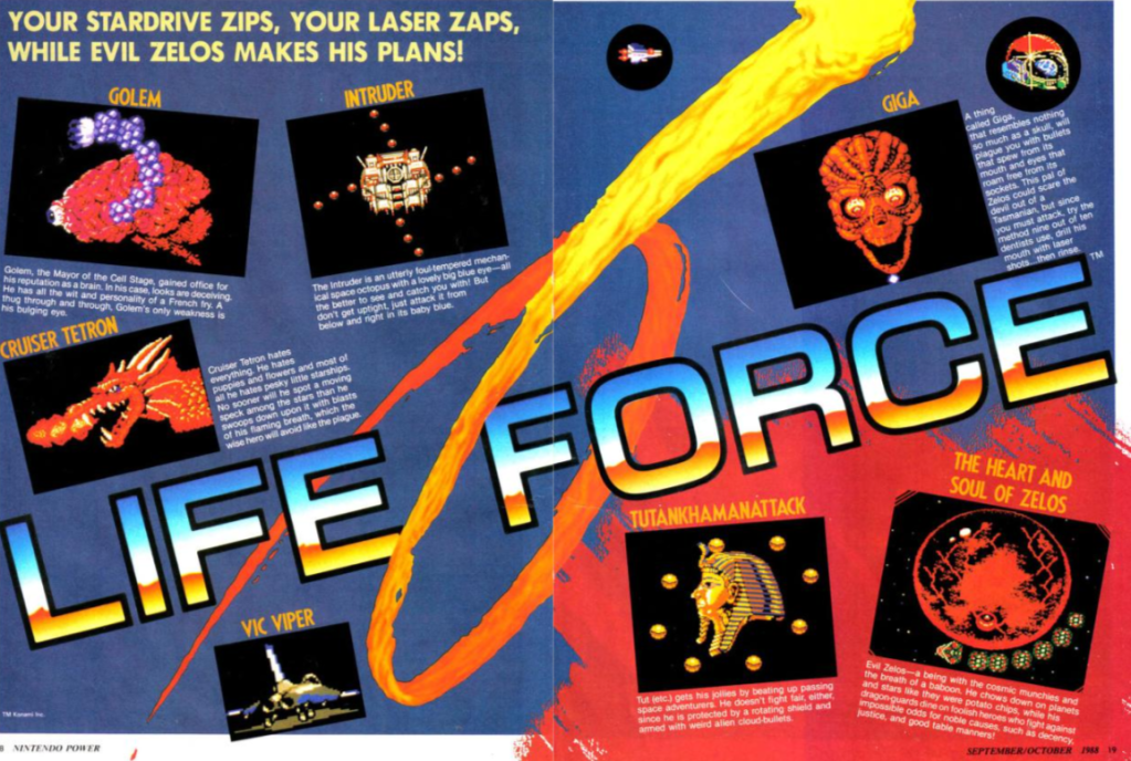
Next we have Life Force. "Your Stardrive zips, your laser zaps, while evil Zelos makes his plans." This game breaks the layout convention we've seen with previous games up to the point. There's no maps included, and I'm wondering if it's because the game is an auto scroller, so getting the screens lined up to take photos would just be too hard? I'm strongly suspecting that's the case. Instead of maps, our first two pages shows all the upcoming bosses. Several pages follow that show tips for each stage. The description of the first stage goes off the rails a bit when they get to talking about the first boss, the Death Hands of Phenom, and say, "Please note that Wembley's Fifth Galactic Dictionary defines the word dread as: 'the chilling sensation one feels when meeting the Death Hands of Phenom.'" Thanks, NP, I hadn't looked that word up in my copy of Wembley's Fifth Galactic Dictionary.
Finally at page 24 we get to our cover Story, Castlevania II: Simon's Quest. These pages would have been a Godsend back in the day, as anyone who has played this game can tell you the path forward can be pretty obscure at times, not helped by the fact that citizens can give you obscure clues or just flat out lie to you to throw you off the trail. This issue is packed with maps and tips to help players prevail. And thankfully, it's also packed with original character art! Let's take a look at Nintendo Power's versions of these gruesome monsters.
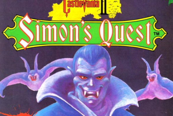
So yes, Dracula does not look quite as foreboding as he might think he does here? Maybe being undead means you get way more muscles in your mouth, but not only is that one big mouth, that menacing smile is just all over the place. Oddly enough, right next to this picture on the adjacent page is the cover art for the game, so you can see a much more menacing Dracula right next to this one.
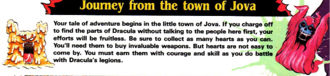
Okay, stop right here, because these guys are just too adorable. Look at this mudman guy just trying SO HARD! And then there's a skeleton/ghoul/reaper in jammies? I'm now officially their biggest fans. Forget the Howard and Nester comics, give me Mudman and Jammy Reaper, please, I want to know all the antics these two get up to wandering the countryside between the towns of Jova and Veros.
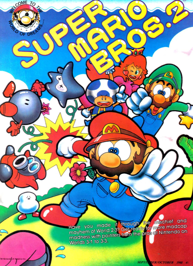
We're back with more Super Mario Bros 2 coverage! It starts with a full page illustration of the four heroes kicking some butt. Princess Toadstool is looking kinda sassy, and Mario has maybe a fire flower in his mouth? Which weren't in Mario 2, so who knows! Still looks catchy!
After that we've got Renegade, which has the same brief layout that Life Force did. This one isn't an auto-scroller, but maybe they figured maps wouldn't be that useful in a game where you just walk right beating up guys?
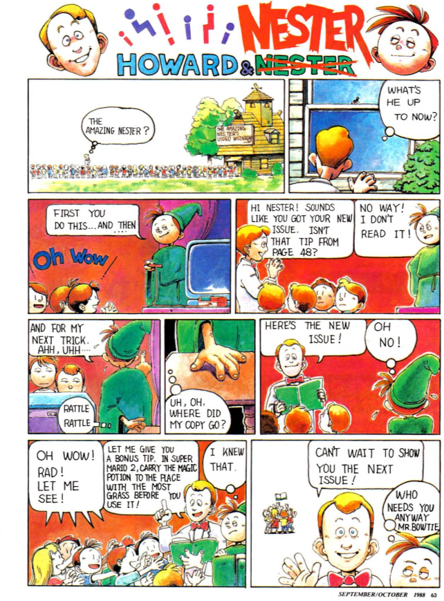
The Howard and Nester comic still keeps them in the 'real world', with Nester just impressing the neighborhood kids with his gaming skills, which he acquired with Nintendo Power. C'mon man, when are you guys going to have adventures inside the games themselves?

Golgo 13 gets covered here, and man, I love the fact that they are using official art from the manga, or what I'm sure was the game publisher but clearly art from the manga. That's a catchy looking two page spread there! They spend some time talking about the story behind the game's adventure, which they'd have to since no one would know Golgo 13 back then, especially kids. The game is pretty interesting, with a mix of gameplay styles, going from side scrolling to first person sniping to a first person 3D mazes. It's an ambitious title!
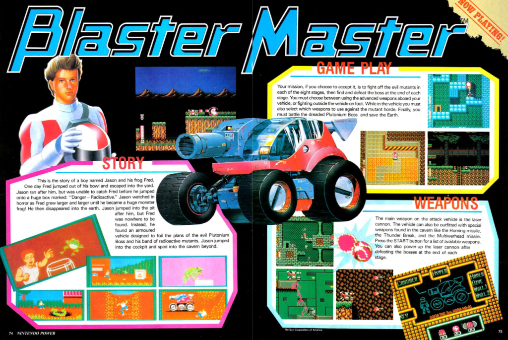
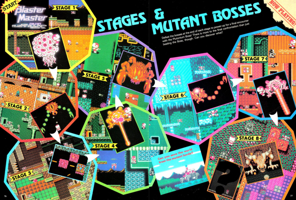
There's a four page feature on Blaster Master, and it is a joy to behold. We've got some clashing art styles in these pages, and I'm guessing the character art of Jason is from a magazine artist, and then maybe the vehicle is official art, because it's super detailed. I love the crazy layout on these pages; the first two pages just break down the story and basic gameplay. Then the next two pages just hit you with nonstop noise and excitement. STAGES! MUTANT BOSSES! It's all over the place, but I'm telling you I am sold.
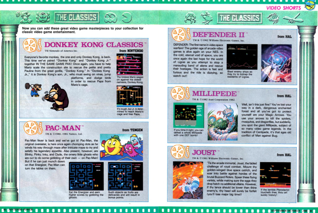
I can't believe there's a feature about "The Classics" in volume 2 of Nintendo Power from 1988! I guess there was never a time when we weren't nostalgic for old games! In the case of these games, it's NES conversions of arcade games like Xevious, Donkey Kong, Pac-Man and Galaga. I guess in 1988, 1982 seemed so far away.
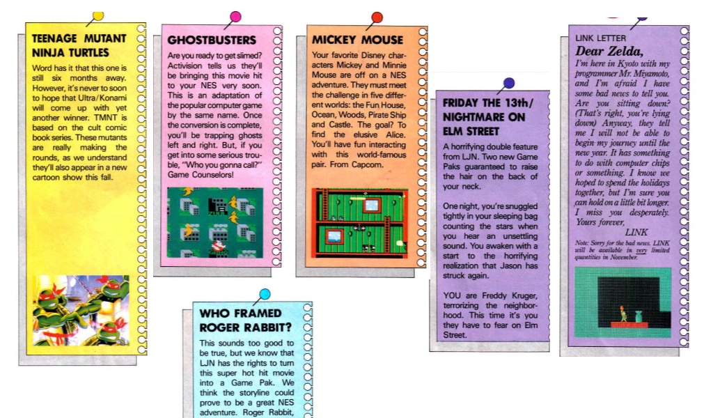
The Pak Watch section has a ton of small blurbs about upcoming games to get excited about. They start off by breaking the news that Zelda 2 is delayed. Then they announce Ghostbusters, which hey, is a great movie and a great computer game, so reason to be excited. But yeah, not going to be a good NES game! Mickey Mousecapades, Roger Rabbit, Bubble Bobble and more are covered. I have to point out this one though, announcing Teenage Mutant Ninja Turtles being 6 months away. It is based off the cult comic, and says they have a cartoon coming soon. Turtlemania hadn't even begun yet! We also get a sneak peek into a game that was never to be, as the description for A Nightmare on Elm Street says that you play Freddy Krueger, which is certainly not the game we ended up getting!
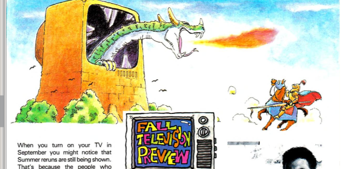
There's an entire page dedicated to upcoming TV shows for the Fall season? I've never heard of these shows before, and certainly don't think I would have been interested in them when they were out. There was a show based on the movie Dirty Dancing??? But I only mention it because they put some amazing artwork on the top of the page of a dragon leaning out of a TV and it looks great.
Overall this is a solid issue with some good coverage and some absolutely amazing original art. Seriously, I've got to write some fanfiction where I meet up with Mudman and Jammy Reaper and we go on whimsical adventures together. And that "Classics" section is so surprising. Nostalgia never gets old!